AFRICABAThe True Size Collection

Africaba presents

The True Size Collection

See the world in its true size.

For centuries, the world's most familiar maps have distorted the relative size of continents. In September 2026, the United Nations overwhelmingly supported a resolution encouraging more accurate, equal-area representations of our world.

Africa is the world's second-largest continent — and it's much bigger than many of us were taught to visualize.

Shop the Collection →
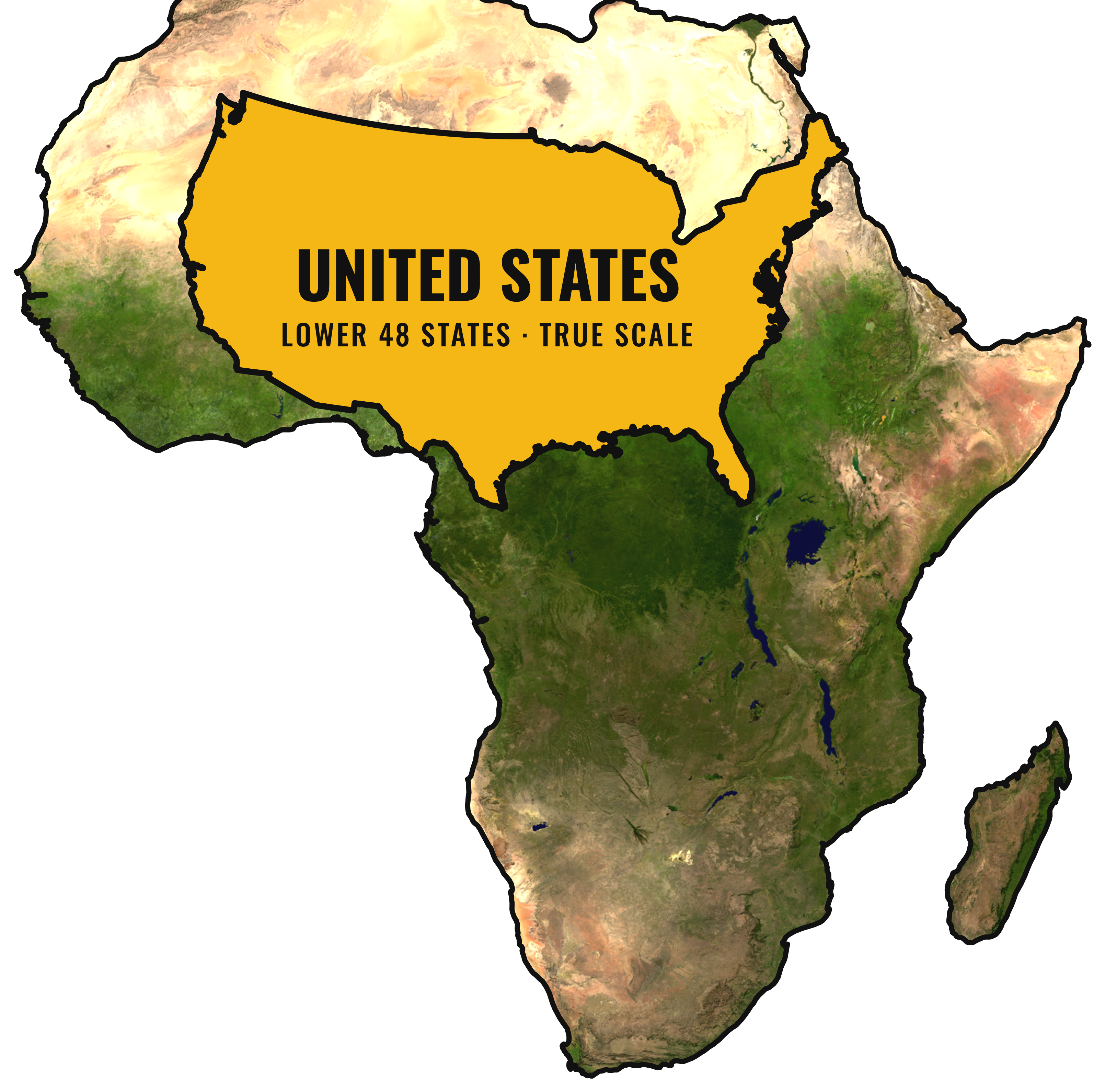
Africa colored from NASA satellite imagery — Sahara, Namib and Kalahari deserts in tan, Congo rainforest and West Africa in green — with the lower 48 United States overlaid in gold at true scale
Africa — 30.37 million km² · satellite-true colors · Equal Earth projection

Africa has approximately…

US
3.1×
the area of the United States
9.8M km²
CN
3.2×
the area of China
9.6M km²
IN
9.2×
the area of India
3.3M km²
GL
14×
the area of Greenland
2.2M km²
GB
125×
the area of the United Kingdom
0.24M km²

Why have our maps been lying to us?

The Mercator projection (1569)

The map most of us grew up with was designed for navigation, not accuracy. To keep compass lines straight for sailors, it stretches land farther from the equator — dramatically inflating Europe, North America, and Greenland while shrinking equatorial regions like Africa. On a Mercator map, Greenland looks roughly the size of Africa. In reality, Africa is about 14 times larger.

The Equal Earth projection (2018)

Equal-area projections like Equal Earth preserve the true relative size of every landmass. Countries and continents appear in proportion to their actual area on the planet — no region inflated, no region diminished. It's the view of the world the United Nations has now encouraged mapmakers to adopt.

Our sources

These aren't marketing claims — check them yourself.